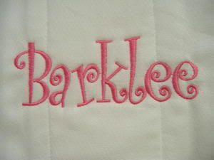
I absolutely HATE Curlz fonts. They are ridiculous, especially for anyone over the age of seven. It is as though the toy corporation that created Barbie played a really mean prank on the font industry and introduced this font, so that anyone trying to be cutesy, playful, or girly by using this font would turn off viewers immediately.
At least that is what this font does for me.
It does not look much better as an italic, and when it is shrunk, it is barely legible. And when this font is used for a body copy? Forget it. It makes your eyes burn. The letters are facing in different directions and the small letters are different heights, which makes it annoying to read.
I feel as though this font has absolutely no functional value and should be taken off of the Microsoft Office programs and Adobe Suites, as soon as humanly possible.
Then again, I may be biased because I hate anything so obnoxiously girly, and have a special vendetta against this font because it is usually used in pinks, fuscias, and baby blues, by pre-teenage girls on myspace.
No comments:
Post a Comment